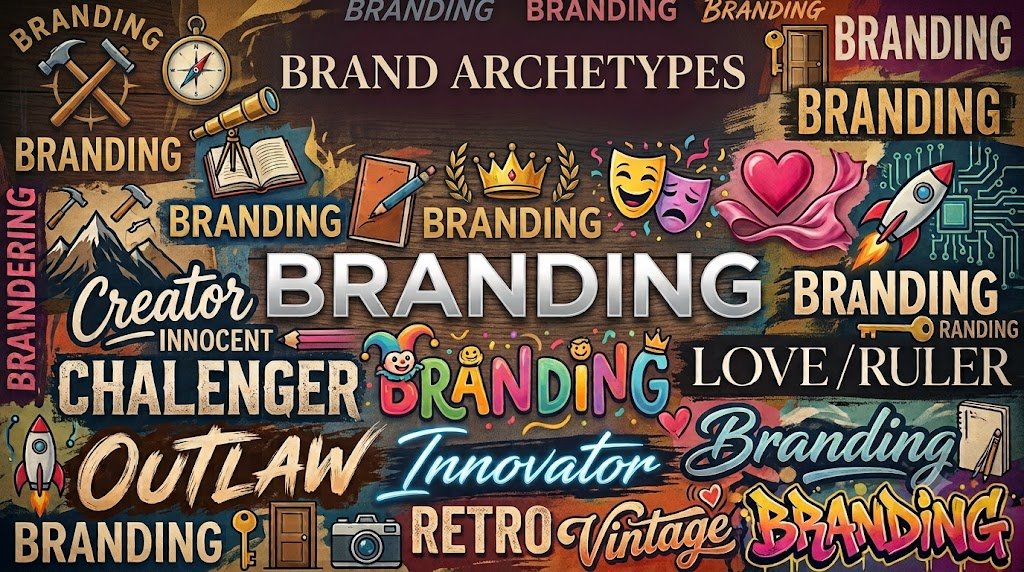
Finding Your Brand’s True Identity: How Voice and Visuals Build an Unforgettable Brand
You’ve probably seen it before: a sleek, ultra-minimalist website designed like a luxury art gallery, paired with pushy, aggressive sales copy that reads like a late-night infomercial. Or maybe a warm, approachable local service business whose graphics look like a cold, corporate tax firm. When your messaging and your visual identity pull in opposite directions, prospective clients feel an immediate disconnect — even if they can’t quite put their finger on why.
Great branding isn’t just about having a pretty logo or writing catchy headlines. It’s about alignment. When your visual design and your copy speak the same language, your brand becomes instantly recognizable, deeply persuasive, and effortless to trust. The easiest way to achieve that harmony is by anchoring your brand to a clear archetype.
Whether you’re launching a new venture or refining an established business, understanding your brand archetype gives you a framework for every word you write and every image you design. There are numerous archetypes out there, so I’m just going to break down 3 examples complete with real-world scenarios, visual directions, and copy to give you an idea of how the right architectural alignment can enhance your business.
The Direct Challenger
The Concept & Copy
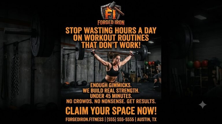
This archetype is bold, unfiltered, and completely unapologetic. Instead of wasting time trying to please everyone, it cuts through noisy marketing by directly calling out generic workouts, empty promises, and modern gym culture. When writing for a Challenger, ditch the long preambles and fluffy intros in favor of short, punchy sentences. Lead with direct contrast—framing the problem sharply before offering your solution—and rely on high-energy verbs like ditch, break, demand, and reclaim to set a confident, fearless tone.
Visual Direction
Visually, the Challenger relies on heavy, oversized typography that demands immediate attention on the page. Color palettes stick to stark, high-contrast combinations—such as pitch black paired with bright white, neon orange, or high-voltage red. Layouts are raw and minimal, using bold color blocks and heavy borders while cutting out all decorative clutter so the headline takes center stage.
The Empathetic Partner
The Concept & Copy
The empathetic partner, or Nurturer, is built on deep human connection, active listening, and total psychological safety. Rather than using high-pressure sales tactics or dramatic claims, this archetype creates a welcoming space where clients feel seen, validated, and genuinely supported. When crafting copy for a nurturer, rely on warm, conversational phrasing and relatable narrative elements. Keep sentences flowing naturally and focus heavily on relief and long-term well-being, using supportive, reassuring language that lowers the reader’s defense mechanisms from the very first sentence
Visual Direction
Visual choices for the Empathetic Partner emphasize warmth, comfort, and calm. Color palettes lean on organic earth tones, soft terracotta, muted sage greens, and warm neutral pastels to evoke tranquility. Typography pairs approachable, clean copy with gentle, classic headlines that convey quiet stability. Layouts incorporate generous padding, rounded soft edges, and authentic lifestyle imagery featuring candid human moments, natural light, and inviting physical spaces.

The Trusted Craftsman
The Concept & Copy
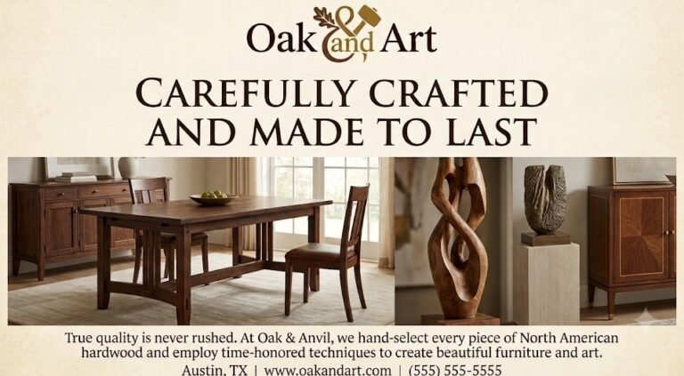
The Trusted Craftsman—often referred to as the Heritage or Expert archetype—is anchored in quality, deep expertise, mastery of process, and uncompromising standards. This brand prioritizes doing things right over doing them fast, positioning itself as a premium option for those who value longevity. Copy for a craftsman must be measured, articulate, and intentional. Every sentence should feel polished, avoiding trendy jargon or hyperbolic claims in favor of subtle sophistication that reinforces long-term value and attention to detail.
Visual Direction
Visually, the Trusted Craftsman relies heavily on classic headlines that convey a sense of history and stability. Color palettes often draw from rich, traditional, and muted tones such as deep navy, forest green, burgundy, and charcoal. Layouts are highly structured and precise. To support the messaging. Imagery should feature photography that focuses on textures, materials, tools, or hands-at-work, emphasizing the physical process of creation.
Choosing the right brand archetype isn’t just an exercise in aesthetics—it’s a foundational strategy that dictates how your business communicates, connects, and converts. When your visual identity, tone of voice, and core copy work in harmony, your audience immediately understands who you are, what you value, and why you are the right fit for their needs.
Published 8/4/2026 by Jon Virdell